What are the things that should be emphasized while designing a website? What are the principles that should be followed to develop a user-centric design?
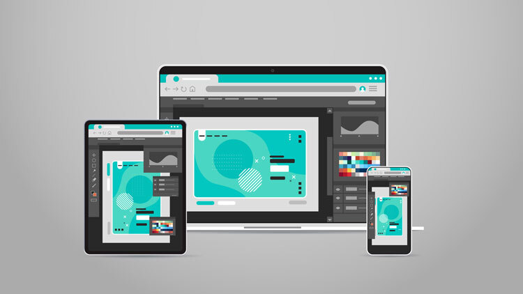
Basically, there are many aspects that are involved while designing a website. Only, when there is a proper balance between visual and abstract elements the result will be a good functional website. In other words, concentrating only on either of one element will not suffice in the growth of a website. But on the whole, abstract elements like usability, navigational structures and layout traditions have a major leverage on the overall design and functionality. Nowadays, websites are going responsive, squeezing into every possible device out there. But the question is to understand the underlying orderly composition.
Being Responsive – Factors Involved
Layout or skeletons are playing a major role in deciding the flexibility of a website. Symmetrically balanced layouts are the perfect go for developing beautiful responsive sites. For a page to be responsive fluidity is a must, for that CSS Grid layout module comes into picture. Grid layout, which is defined in CSS, enables us to change the position of page elements in accordance to the requirements. In general, a grid allows us to move with a systematic approach while creating a proper functional layout.
A website is the face of an organization, so a visually appealing site alone cannot generate more customers, but an easily accessible one can. Bad layouts with uninviting designs and loud content can easily repel potential customers. Also, content in a website is not restricted to only text but, other components such as graphic designs, images and inter-links. Arranging these components systematically can give a professional touch to the overall appearance. This can happen only if the layout is customizable.
Lot of factors like conversion rates, bounce rates and SEO are dependent on good responsive designs. One can see a gain of momentum in these factors only when the site is accessible through all the available courses.
The Bottom Line
The word “Resolution” carries a heavy weight around it, as it almost decides the performance phase of a website. Like the quote “Progress is impossible without change”, a growth or success is not possible unless there is fluidity in every aspect of plan. CSS is growing by every minute, whether it is fixed or fluid grid; the websites are becoming more accessible and functional.