

Picture a local business — say, a company that fixes air conditioners — that shows up near the top of Google when someone searches “AC repair near me.” Traffic looks good. The owner checks their website stats and sees hundreds of visits every month. But the phone barely rings, and the contact form gets maybe one message a week.
Website lead generation depends on more than simply attracting visitors. A website can receive traffic and still generate very few phone calls or form submissions if visitors cannot quickly understand the offer, trust the business, find the right information, or see what they should do next. Identifying and removing these obstacles can make the website more effective at turning existing traffic into genuine business enquiries.
That gap happens more often than most business owners think, and it’s almost never about traffic. It’s about what happens in the few seconds after someone actually lands on the page — and that usually comes down to website design choices nobody thinks to question, because the site “looks fine” to whoever built it. Here’s what really happens, step by step, when someone visits.
The First 3 Seconds: Does the Page Load Fast Enough?
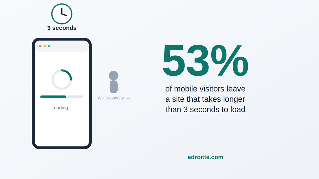
Google’s own research found that 53% of people on their phones will simply leave a site if it takes longer than three seconds to open. For our AC repair company, that’s more than half of everyone searching “emergency AC repair” from a hot car, phone in hand, already running low on patience.
Fixing this almost never means rebuilding the whole site. Usually it’s just picture files that were never shrunk down, old plug-ins nobody uses anymore, or leftover code from an older version of the site — the kind of thing regular website maintenance catches before it becomes a problem.
The Next Few Seconds: Do They Trust What They’re Looking At?
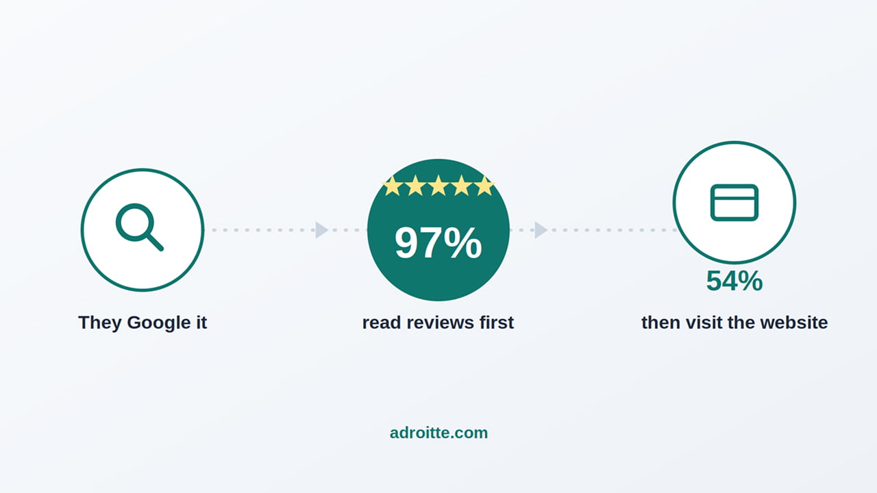
Most people don’t make a cold call to enquire about a business. They Google it, skim a few reviews, and only then decide it’s worth reaching out. A 2026 survey by BrightLocal put real numbers on that habit: 97% of people read local reviews before deciding, and 31% say they won’t use a business rated under 4.5 stars. Even how recent the reviews are matters — 74% specifically look for ones written in the last three months.
Here’s the number that matters most for a website: 54% of people who read good reviews go check out the business’s website next, up from just 32% back in 2019. That means a visitor often shows up already leaning your way. If your homepage does nothing to back that up — no reviews, no photos, nothing that says “a real, trusted business is behind this” — you’ve thrown away an advantage that didn’t cost you anything to build.
When They Look for What to Do Next: Is the Button Actually Working?
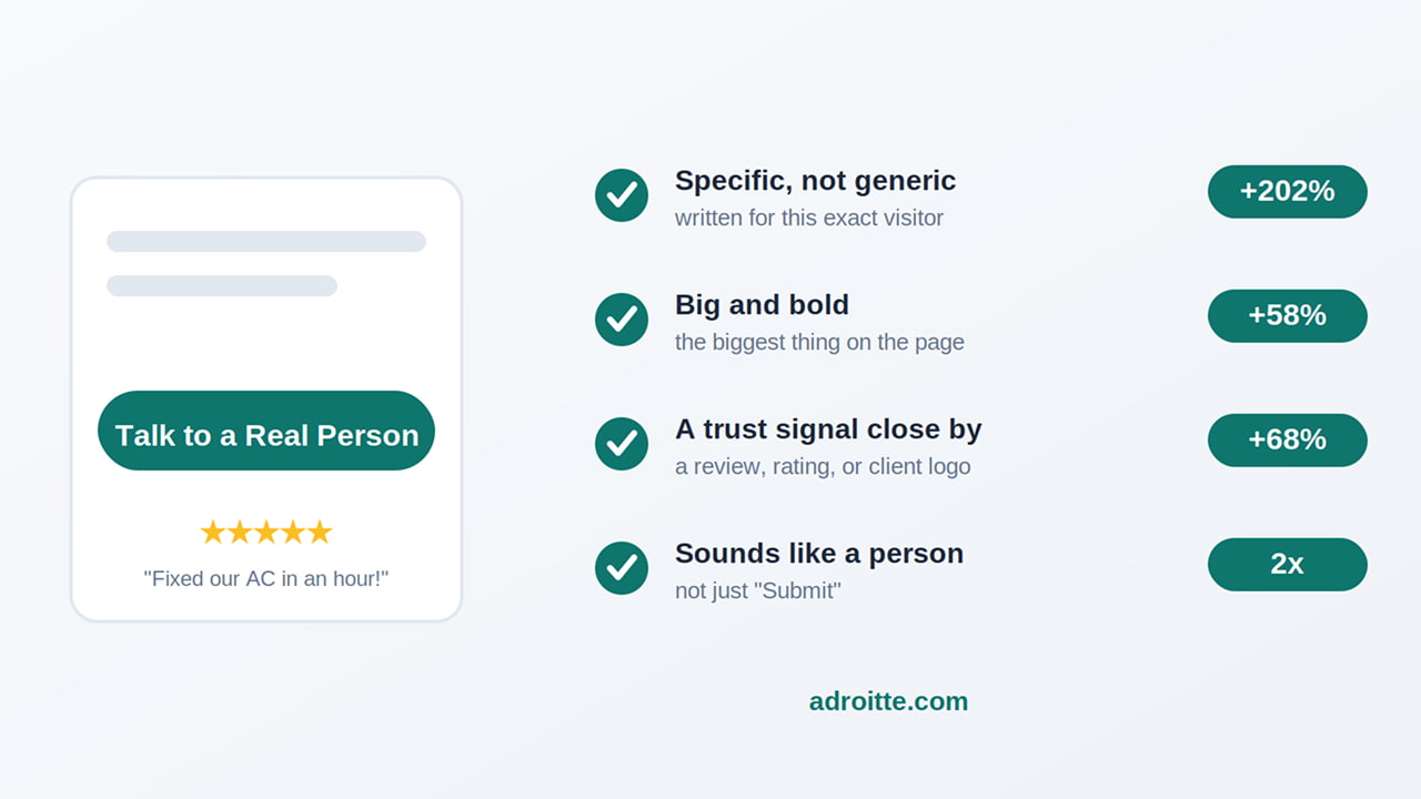
A “call-to-action,” or CTA, is just the button or line of text that asks someone to actually do something like “Call Now,” “Get a Free Quote.” Having one on the page isn’t the same as having one that works. It’s worth checking your own against a short list:
- Does it say something specific, or the exact same line on every page? HubSpot looked at over 330,000 of these buttons and found ones written for the specific visitor perform 202% better than generic ones.
- Is it the biggest, boldest thing on the page, or does it blend in? Making it bigger and bolder alone lifted results by nearly 58% in HubSpot’s testing.
- Is there anything reassuring sitting right next to it, like a review or a client logo? That alone added 68%.
- Does it sound like a real person, or does it just say “Submit”? Something like “Talk to a Real Person” has more than doubled results in some tests.
Most businesses have never actually checked their own button against this list. It takes less time than reading this section.
When They Finally Try to Reach Out: Does the Contact Us Form Scare Them Off?
If the main way someone contacts you is a contact form, that form is very often where people quietly give up. HubSpot found that removing just one unnecessary field increased submissions by more than 25% — not because the extra field was hard to fill in, but because every question adds one more moment of hesitation about handing over details to a business you’ve never dealt with.
The businesses that do well here ask for almost nothing up front: a name, a way to call back, and one line about what’s needed. Everything else — budget, timeline, project details — can wait for the actual phone call, once a real conversation is already happening. A short line near the button (“We’ll never share your information”) costs nothing and quietly removes one more reason to hesitate.
How to Improve Website Lead Generation: How to Bring In Conversions?
A slow-loading website, content that doesn’t build trust, a call-to-action that doesn’t work, or a contact form that feels too complicated can all cost you valuable leads.
The good news is that fixing these issues doesn’t necessarily mean redesigning your entire website. Start by identifying where visitors are dropping off and focus on improving the areas that are stopping them from taking the next step.
If you can only tackle one thing first, start with page speed and trust signals. They’re relatively simple to fix and affect almost every visitor to your website. Your call-to-action and contact form matter just as much, but they can only help once a visitor has decided to stay and engage with your site.
If you’re not sure where to start, a professional website development and digital marketing company can review your website and identify what’s getting in the way of conversions.
Reach out through our contact form and we’ll get back to you promptly. We’ll look at your website the same way we’ve walked through the issues in this article and tell you plainly which areas could be costing you valuable leads.