Every year there’s a new list of “web design trends,” and most of it is just what looks cool right now. But a few of this year’s trends aren’t just about looks — they actually change how people behave on your website: how long they stay, how far they scroll, and whether they finish filling out a form. Here’s what’s real, explained simply.
Conversion focused web design is about more than making a website look modern. In 2026, businesses need websites that combine visual design with usability, clear messaging, mobile responsiveness, performance, trust, and simple paths toward action. The most useful design trends are the ones that improve how visitors experience a website while also helping businesses generate enquiries, sales, bookings, or other meaningful outcomes.
These trends are especially useful when planning or improving a business website because good design should do more than look modern — it should help visitors understand what you offer and take action. If you’re evaluating your current site or planning a redesign, a professional website design services can help turn these principles into a more effective user experience.
Bento Grids: Boxes of Different Sizes That Guide the Eye
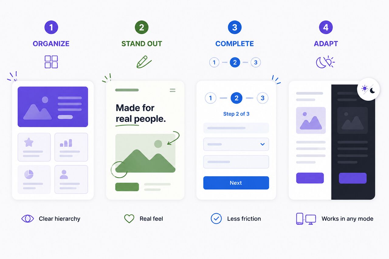
You’ve probably seen this layout even if you didn’t know its name — a page broken into a grid of boxes, but the boxes aren’t all the same size. Some are big, some are small, a bit like a Japanese bento lunch box with different-sized compartments.
Why does this work? Because our eyes naturally look longer at bigger things. Nielsen Norman Group, one of the most respected research groups that studies how people actually use websites, has shown this for years: if every box on a page is the same size, people don’t know what to look at first. Make the important box bigger, and people notice it first without even thinking about it.
Good for: pages with several services, features, or examples to show off. Not needed for: a simple page with just a few lines of text and a contact form — that doesn’t need fancy boxes.
A Return to Looser, More Natural Layouts
Once everyone started using bento-style grids, they stopped feeling special. So some brands are now doing the opposite on purpose — looser, more free-flowing layouts instead of neat boxes. It’s simply a way to stand out once a trend becomes the new normal everywhere.
This works well for creative brands or portfolios that want to feel different. It works less well for a page that’s trying to present a lot of information clearly — for that, the neat boxes are still more useful.
Breaking Long Forms Into Smaller Steps
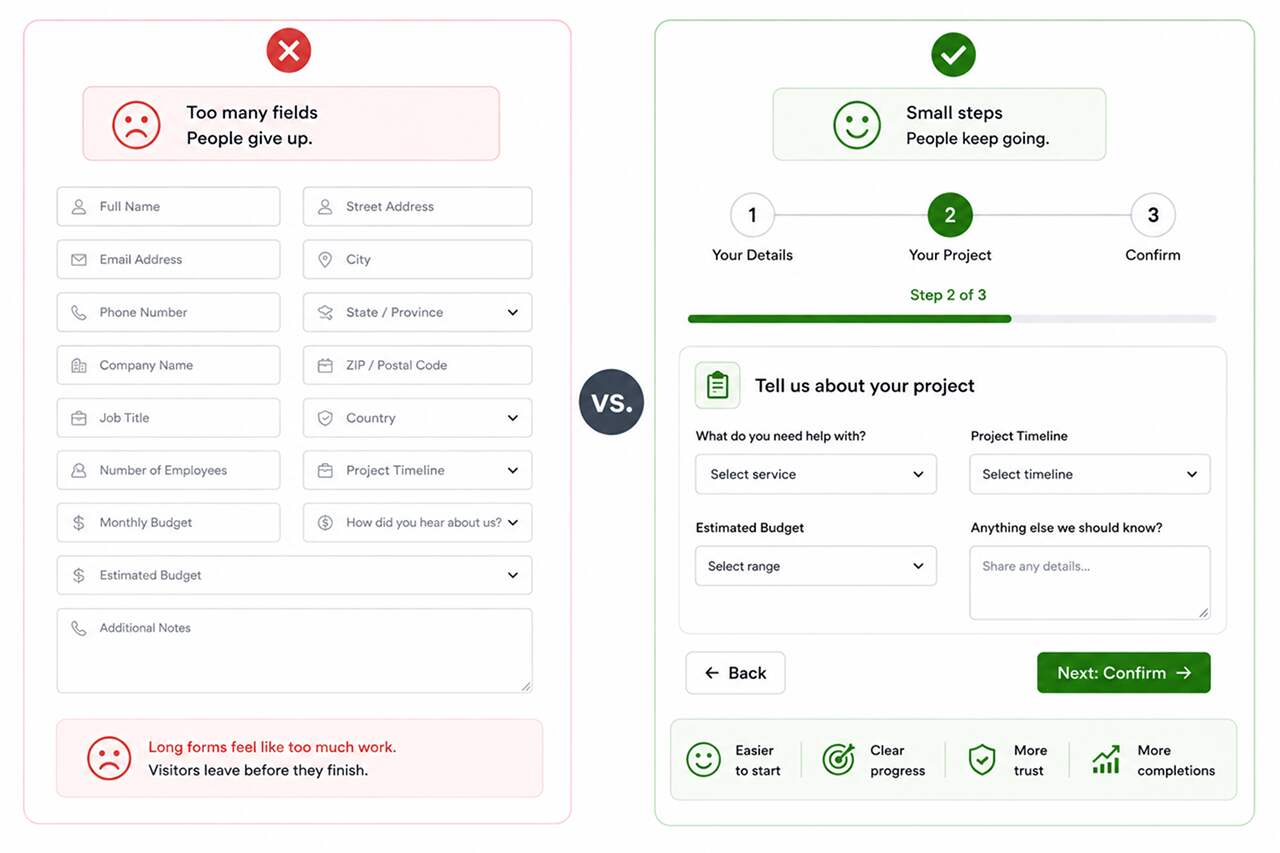
This is the one with the clearest proof behind it. Baymard Institute, a research group that has spent over a decade studying online checkout and forms, has repeatedly found that a long, complicated form is one of the top reasons people give up partway through.
The fix is simple: instead of one huge form with 15 fields, break it into 3 short steps — like “your details,” then “your project,” then “confirm.” Even though it’s the same amount of information, it feels much less overwhelming. Adding a small progress bar (“Step 2 of 3”) helps even more, because people don’t like quitting something when they can see the end is close.
A Trust Badge Can Save a Sale
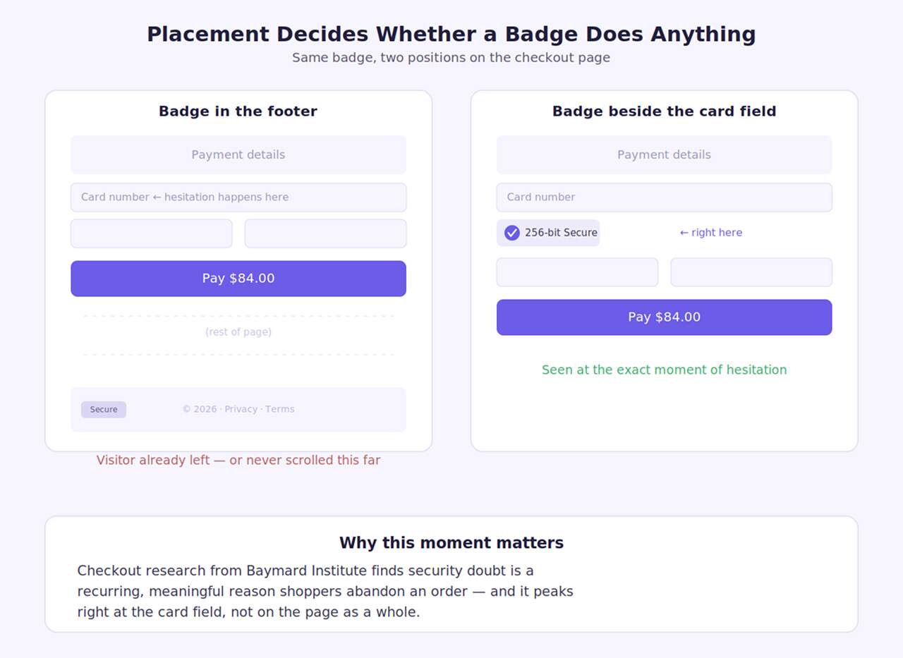
People don’t abandon checkout because they changed their mind about the product — often they abandon it because they got nervous about the payment step. Baymard Institute’s research on checkout behavior has repeatedly found that a meaningful share of shoppers cite distrust of the site as their reason for walking away, and that a recognizable security badge placed right next to the card field measurably eases that hesitation.
The placement matters as much as the badge itself. A trust seal buried in the footer does almost nothing. The same badge sitting directly beside the card number field, at the exact moment someone is deciding whether to type it in, does real work.
Micro-Interactions: The Small Moments That Build Confidence
A button that looks identical before and after you tap it leaves a visitor guessing. Did it register? Should they tap again? That half-second of doubt is small, but it happens constantly — on every add-to-cart, every form submit, every “save” click across a visit.
A slight color shift, a brief animation, a checkmark that confirms “this worked” — these micro-interactions don’t add new functionality, they just close the gap between an action and its confirmation. Individually they’re barely noticeable. Across a whole session, they’re the difference between a site that feels responsive and one that feels unreliable.
What Is Conversion Focused Web Design?: The Simple Way to Decide What to Use
You don’t need all four of these everywhere. Ask yourself:
- Do visitors see several competing buttons before they act? → Cut it down to one primary call-to-action per page.
- Do people abandon checkout right at the payment step? → Add a trust badge next to the card field.
- Is most of your traffic on mobile? → Move key actions into the thumb-friendly bottom zone.
- Do buttons look the same before and after someone clicks them? → Add a small confirmation state.
If a trend doesn’t map to a real behavior you’ve noticed on your own site, it can wait — there’s no prize for using all four at once.
Once you know which of these are worth building, execution is what makes or breaks them — a trust badge that loads slowly or a button state that stutters undercuts the whole point. professional website development services can make sure these details actually hold up in a live browser, not just in a mockup.
A Word of Caution
Not every “trend stat” you read online is trustworthy. A lot of the big, exciting numbers floating around (like “this layout increases clicks by 40%!”) come from a single design agency talking about their own work, not from any independent study. That doesn’t mean the idea is wrong — it just means you shouldn’t take every number at face value. The trends explained here are backed by real, independent research groups, not just marketing claims.
Final Thoughts
The trends that actually matter this year all do one simple thing: they make it easier for a visitor to understand your page and take action, instead of just making the page look trendy. Bento grids help people see what’s important. Shorter forms help people finish what they started. Dark mode meets people where they already are. Pick the ones that solve a real problem on your site, not all of them at once.
None of this requires a full site rebuild to test. Even trying one change — like turning a long contact form into a two-step form, or checking whether your site properly supports dark mode — is a small, low-risk way to see if it actually makes a difference for your visitors before committing to a bigger redesign.
If you’re not sure which of these changes would actually help your website, Adroitte’s website design services team can take a look and tell you honestly what’s worth doing. Once the site is designed to convert, digital marketing services can help bring the right audience to it.
Is Your Website Design Built to Convert in 2026?
A modern website should do more than make a strong visual impression. It should create seamless user experiences, guide visitors toward action, and support your broader business goals.
Reach out through our contact form and we’ll get back to you promptly. Let’s put the latest web design trends to work for your business and create a website that looks modern, performs effectively, and turns more visitors into customers.