Landing page, eh, what is that on a website?
‘A website landing page is page that appears as soon as a user clicks on a particular search engine result link or PPC.’
The purpose of creating a landing page is to narrow the focus of visitors to a particular web page and compel them to be a part of the long conversion funnel.
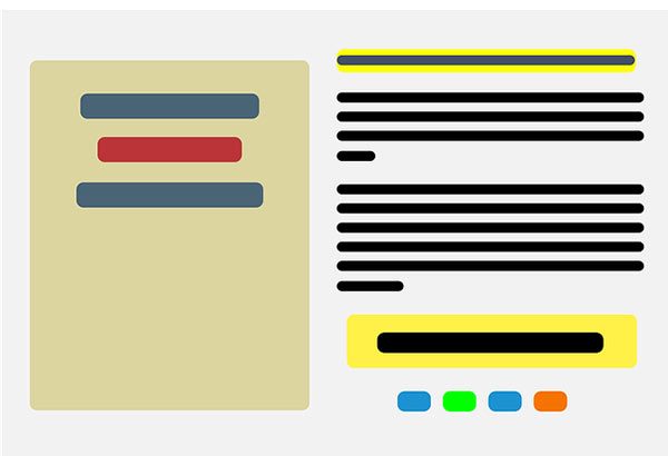
A landing page/destination page looks like this,

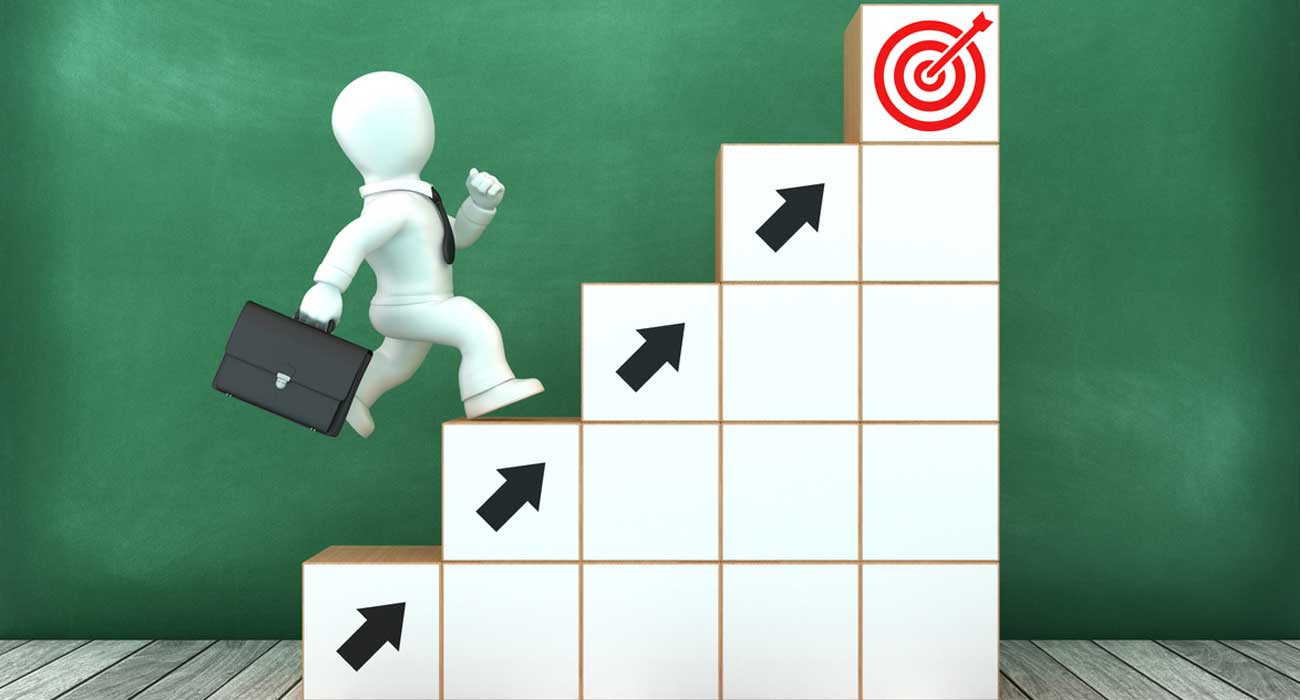
So it’s quite clear you have to build a landing page that converts, right?
Certain things you should be clear off before creating a landing page and here is the list.
- What is the goal?
- Who is your competitor?
- Who is your target audience? Or to whom you are building this website?
- What is the source of your website landing page visitors?
Steps to create a Landing Page that Convert
- A CLEAR CALL TO ACTION
- Guiding where they have to click or what they have to perform after landing on a particular web page is very crucial.

- Can you just see how clearly the call to action has been defined?
- Sign up, Shop now, subscribe today, are some of the clear, tempting words that push visitors towards conversion funnel.
- To make visitor take the desired action, the CTA should have,
- Visually distinct design.
- Words that are simple and easily digestible, and is
- Logically placed for optimal engagement.
- OFFER
- ‘10% discount on your first purchase’
- Or when people see something like this, what will be their further action?

- ‘If you are fishing, you should use bait, tastier the bait better will be your catch.’
- Words like complimentary, discount, anything that shows your generosity will keep visitors from getting distracted.
- A landing page is something where you can witness both conversion rate and bounce rate; it all depends on elements, how they are designed, the words used and where they are positioned.
- FOCUS (KEEP IT VERY NARROW)
- What does it mean to have a clear focus on a website landing page?

- It says you should not offer too many things and give more time for users to make a choice between the options provided. The landing page should be clear, simple, and to-the-point.
- People hardly have time to fill-out forms, so the longer your forms are, greater will be the chances of bounce rate.
- Keep the fields in lower numbers and enjoy higher response rate.
- RETAINING IMPORTANT ATTRIBUTES
- A visitor on the landing page would convert to a customer when he finds that the product is addressing the problem.

- In the above illustration, it is being directed that the visitors can use the product for free.
- The word ‘free’ doesn’t always work unless the purpose is defined.
- If your mission is to create a winning landing page, you should clearly start with a user perspective. What they would gain or how they would benefit from that product and it has been done above.
- In simple words, you are defining the purpose of using the product, by defining the pain point, benefit, and its feature.
- COMPELLING HEADLINE
- One of the oldest tricks in the marketing book is to have a solid headline.
- Newspapers sell in a shop because the headline catches the eye and make people buy and go through the content.


- Observe both illustrations, do you find any reason not to proceed with the actions that are being asked to perform?
- Clearly, a good headline is something that defines
- Clarity
- Relevance
- Empathy
- In few plain words, you can easily turn a visitor into your customer but should know how.
- PROMISE THE BEST RESOLUTION
- ‘Above the fold’, ‘below the fold’ in responsive design, such words you would not have heard unless you are a website designer.

- ‘Above the fold’ refers to website content that is visible without user having to scroll, while to access content ‘below the fold’, the user needs to scroll.
- But how is this related to a website landing page?
- Today, websites are accessed across various devices, monitors, tablets, and Smartphones. So it would be more influential if all the important landing page elements are visible above the fold irrespective of the device used.
- THE VISUALS
- Keep it simple, because even Google loves it.
- A landing page should look good to perform well. As similar to headlines, images are another crucial part of a landing page. Images have a bigger role in defining conversion rates. Longer it takes to a webpage takes to load, lesser will be the chances that a user stays on the website.

- A landing page is not a homepage, so using extravagant visuals can actually distract the users from moving further into the conversion funnel. So, keep it simple; keep it bare to avoid visual clutter.
- SOCIAL PROOF (DON’T FORGET TO ADD THE TRUST SIGNALS)
- The case studies, testimonials, social sharing buttons, are few to name.

- Customer quotes can do magic on conversion rates. It’s similar to word-of-mouth marketing, as people incline greatly towards what others have to say about a product or service. So adding such metrics would greatly press for the attention from the audience.