We see millions of website across internet built with various frameworks. But do you know why developers use frameworks for building websites and web applications? Because, they promote code reusability, provide libraries and make the development of dynamic websites very easy.
Frameworks are generally open-source, supported by a large community and periodically upgraded to serve better.
Basically, there are two types of frameworks,
- Frontend
- Backend
The difference is made based on whether the framework is used for designing presentation layer (frontend) or the application /logical layer (backend).
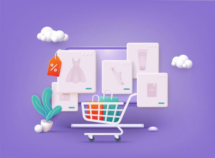
In this blog post, we are going to focus on Bootstrap, a frontend framework and see why it should be used for creating the product page of a responsive e-commerce website.
But first, let’s learn about frontend frameworks/CSS frameworks.
Front-End Framework
Also referred as CSS frameworks, front-end frameworks allow developers to be quick and focus on application-specific issues rather than performing redundant tasks.
CSS frameworks typically contain,
- A grid, which makes organization of design elements easier on responsive websites.
- HTML, CSS, and JavaScript files that allow creating a uniform design, typography, and forms across the web pages.
- Pre-built website components like buttons, side panels, and navigation bars.
In this blog post, we will focus on Bootstrap, a robust front-end framework and analyze the benefits of using the same in designing a detailed Responsive E-commerce Product Page.

Introduction to Bootstrap, the Front-end Responsive Framework
Originally referred as Twitter Blueprint, Bootstrap is one of the most popular front-end frameworks used in the development of responsive websites. This front-end responsive framework has almost 10,000 forks and 40,000 stars on GitHub.
Now, in the further sections, we will be focusing on Bootstrap grid system, built-in classes, and the navigation tabs.
- The Responsive Mobile-First Grid System
Generally speaking, a grid is a two-dimensional structure that consists of two components namely rows and columns. Grid structure helps in developing a consistent layout for organizing content.
Also bootstrap……
It consists of responsive, mobile-first fluid grid system that scales up to 12 columns (across the page) as per the increase in device or viewport size.
Web designers will find Bootstrap convenient and the most reliable option for building a robust e-commerce website.
Bootstrap Grid System: What it is and how it works?
The bootstrap grid system is built with flexbox.
Flexbox/CSS3 flexible box is a layout mode or simply a layout. The layout here is an algorithm that helps in determining the position and size of boxes with respect to parent boxes. With flexible box layout module, web designers can easily create responsive layout structure of all shapes and sizes without having to use floats or positioning.
Note: A flexbox layout includes a parent element and one or more child elements.
All the three elements including the area they are encased in represent a CONTAINER.
The layout and content alignment is easily done as Bootstrap uses a series of rows, columns, and containers.
The Grid system has four (grid) classes – xs, sm, md, and lg, for devices with different screen size.
Now coming to the rules/the working process,
- For proper alignment and padding, rows are to be placed within .container or .container-fluid that is within the container
- Rows must be utilized for creating the horizontal groups of columns.
- Only columns may be the immediate children of rows and content must be placed within these columns.
- .row and .col-xs-4 are the pre-defined grid classes that are easily available for making grid layouts.
- Gaps b/w column content is called gutters. These gutters are created by columns via padding. This padding is an offset for the first and last column via negative margin on .rows.
- Grid columns are built by specifying the number of 12 available columns that are available. For instance, if you are to use three columns then it would use .col-xs-4.
Now if we take the product page of an e-commerce website, the elements on your product page will be in proportioned and balanced. Let’s say we are dividing the page into two halves, the 12 columns will be divided between these two divisions, the product information, and product image.
You can even use Nesting Grids, to put a grid within the grid.
- Bootstrap Glyphicons
Coming to the icons found on navigation toolbar or tab bar use Bootstrap Glyphicons. You can use the icons (Glyphicons) for creating visual navigation for your e-commerce web page.
- Bootstrap’s Navigation Tabs
Since you are designing an e-commerce web page, you will have to add various sections at the bottom of your product page. Generally, it will be notes, features, description, and reviews.
The markup for tab navigation comes in two parts, the first represents an actual tab and the following corresponds to tab pane. Each pane has a certain role and corresponds to class and ID. And each ID corresponds to the tab section.
And once the Bootstrap’s JavaScript and jQuery starts running on the page, the tabs will start to work.
The advantage is quite clear, the responsive 12 column grid system. It can be either a responsive Web page or website, but designers will be clear of any complexities if they make use of this responsive grid system.
Call Adroitte
Contact us to discuss your e-commerce related requirement. Call us today on +91 7760487777 or 08041127377 or message us on our contact form and we will reply back ASAP. We can discuss how we can strategically implement e-commerce successfully for your organization.