A logo associates audience with business. A logo marks a major aspect of the marketing campaign because it forms the face of a business organization. But even spending thousands of dollars on professional designers aren’t going to help unless the business logo possesses few characteristics and we will be learning about the same further in this blog.
Conventionally speaking, people think a logo as some random image designed for some brand. But a logo is not just an image; it is a form of visual art that inspires trust in the brand from the audience.
A business logo should be unique, easy to understand, simple, and most importantly connecting with the business values.
Apple, Hewlett-Packard, Dell, actually the list is quite long, so let’s take a reference to top 100 brands from around the world. When you look at each of these brands, what do you find in common?
You don’t have to think so hard,
It is the SIMPLICITY & UNIQUENESS.
If you had expected some technical response, then it shows you belong to that group of people who have no knowledge of branding or designing.
So, let me enlighten you a bit about a good business logo.
5 Principal Qualities of a Great Business Logo
The qualities that will be addressed below may look too basic, but they are the essential ingredients for creating a successful business logo.
- ORIGINAL
- You might have heard this quote, ‘Imitation belittles’.
- When it comes to brand name, it is common to witness people tweak the letters here and there to carry the name similarity and of course, it’s impactful power. But eventually, the time allows the audience to make out the difference, which does nothing to improve the reputation. The same goes for a logo.
- Originality takes the top spot if an organization is designing a logo. A logo is recognized as original if it is simple, resizable, and recognizable from other brands.
- Logos are the visual representation of brands. Any brand defined through original (logo) design, perfectly stands out from the crowd.
- SIMPLE
- Look at those top 100 brands that had a successful journey, their logos never defined the term complication. Each one of them is simple, unique, and easily recognizable.
- It’s understandable that we have numerous font styles, various color shades, and a good number of geometric shapes, but ask yourself this simple question, will your audience interpret your logo design in a single glance? Because not every brand can be Starbucks, you know.
- I’ll take two logo designs of contradicting complexities.


- It is a simple tick versus complex Picasso art. Starbucks is a very know brand and of course, even Nike is a well-known one, but it is also true that not every brand has got it right by overcomplicating the design.
- VERSATILE
- A good logo should function perfectly across various medium and applications. It should look good in full color as well as black and white.
- Professional graphic designers working towards creating a logo should see that it is blending uniformly on every medium, from letterhead, billboard, website, and video.
- To say in few words, a logo makes a successful impact if it easily transits between different Medias.
- APPROPRIATE
- Often we fail to notice or predict the actual purpose of having a logo.
- Behind every successful logo, there is a story.

- Take Amazon, the arrow from A to Z tells that customers will get every product they want to have. The arrow is also a way to say that customers will have a smile on their face after they shop with Amazon. Such a creative way to say, don’t you think?
- Here it is very clear that graphic designer who designed the logo was successful in understanding the culture of the organization, what it sells, and its business values.
- TIMELESS
- A logo should neither age gracefully nor crumble with time, but should be timeless.
- In few words, it should stand the test of time.
- Global brands have evolved during the time that way there are able to stay for so long.

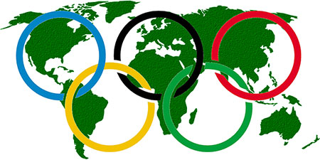
- If you want to exactly interpret the true meaning of timeless, then look at the logo of Olympic Games. You better be curious, because the five rings depict the participating continents and the colors including the background are those shades that can be found on all the national flags.
- It has been few decades or may be more that but still this logo has stood strong and moving with the time.
Call Adroitte
Contact us to discuss your logo designing related requirement. Call us today on +91 7760487777 or 08041127377 or message us on our contact form and we will reply back ASAP. We can discuss how we can strategically implement logo design successfully for your organization.

