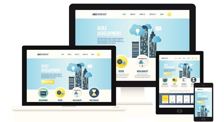
Responsive Design for Mobile Devices has become essential for businesses that want to deliver consistent user experiences across smartphones, tablets, and desktops. As mobile usage continues growing, responsive design helps websites improve usability, performance, accessibility, and search visibility while adapting seamlessly to different screen sizes.
In today’s world, navigating the internet has become a convoluted process for users because of the number of devices available. Responsive Design for Mobile Devices helps businesses create consistent experiences across different screen sizes.
Individuals switch between various devices such as smartphones, laptops, tablets, desktop computers, TVs, and even smartwatches to access the web. Many organizations invest in Responsive Design for Mobile Devices to improve customer engagement and usability.
To ensure a highly satisfactory user experience, it is crucial to ensure that your website appears appealing and functional on screens of all dimensions. This highlights the significance of having a website that incorporates responsive design. Responsive Design for Mobile Devices supports better website accessibility for modern users.
Incorporating responsive design into your website can effectively address numerous challenges. It enables your site to become mobile-friendly, enhances its appearance on screens of varying sizes, and prolongs visitors’ engagement. Additionally, responsive design plays a pivotal role in boosting your search engine rankings.
Why Responsive Design for Mobile Devices Matters Today
If you are planning to revamp your website, it is highly recommended to adopt a mobile-first approach. As smartphones have become more prevalent as the primary browsing tool in today’s digital era, prioritizing the user experience on smaller screens becomes crucial. A mobile-first website design prioritizes easy navigation and information accessibility. Businesses using Responsive Design for Mobile Devices often experience stronger mobile performance.
You may attract a bigger audience to your website, improve user experience, and eventually boost conversion rates by employing a mobile-first strategy. Here are a few reasons why responsive design is important for your website design:

- Cost-effectiveness: It can be costly to have two or more websites for mobile and non-mobile consumers. However, using responsive design allows you to save money by eliminating the requirement for an independent mobile site. Instead, you can save money and time by investing in a single website design that accommodates all users and devices.
- Flexibility: Making adjustments to a website that features flexible design is a quick and easy process. You no longer have to worry about updating multiple websites. This flexibility is really useful, especially when you need to make quick design changes or correct an error on your website. You only need to implement the changes once rather than multiple times across different versions.
- SERP priority: It is widely known that Google has embraced a “mobile-first” approach in recent times. With a growing number of users conducting searches from mobile devices, it has become paramount for websites to ensure seamless rendering across all devices. Google’s objective is to deliver valuable and accessible content to its users. Google prioritizes websites that are optimized for mobile devices and have implemented a mobile responsive web design.
- Improved user experience: For website owners, ensuring a positive user experience is of utmost importance. The goal is to create a site that is not only appealing but also easy to navigate, ultimately enticing visitors to return. However, if a person accesses your website through a mobile device and encounters slow loading times or low-resolution images, it can reflect poorly on your company, giving an impression of unprofessionalism. For an enhanced UX/UI, implementing responsive design can effectively persuade people to give your company a chance. Responsive Design for Mobile Devices helps reduce usability issues caused by inconsistent layouts.
- Improved Page Speed: The loading speed of your website is a crucial element that significantly influences your SEO and, consequently, your position in search engine rankings. The speed at which your website loads can either enhance or hinder the user interface of your site. Therefore, it is unsurprising that optimizing your website to load swiftly and seamlessly is imperative. Mobile responsive websites, designed to cater to both mobile and desktop devices, exhibit faster loading times. By optimizing your page speed, you can attract more traffic to your website and increase the likelihood of conversions.
In Conclusion
Modern website strategies increasingly prioritize Responsive Design for Mobile Devices to support mobile-first browsing behavior. Building or revamping your website with a mobile-friendly approach forms a solid foundation for success. Google recommends responsive web design because it uses the same content and URL structure across devices while adapting layouts based on screen size.
By adopting a responsive design, you prioritize the user experience, ensuring seamless engagement with your site while signaling to Google that your website is optimized for search across all devices. Responsive Design for Mobile Devices improves navigation and readability across smartphones and tablets.
Planning your web design from the outset enables you to establish a well-optimized structure that remains easily accessible on any device. Businesses adopting Responsive Design for Mobile Devices can strengthen long-term digital performance.
Call Adroitte
Contact us to discuss your website development requirement. Call us today on +917760487777 or 08041127377 or message us on our contact form and we will reply back ASAP. We can discuss how we can strategically website development for your organization.