Color contrast website design plays a major role in shaping how users perceive, navigate, and engage with a website.
When it comes to designing a website, there are many factors to consider in order to create an effective and engaging user experience.
One of the key elements that can make a website stand out is the use of color, contrast, and clarity.
Effective color contrast website design helps businesses improve readability and visual accessibility across digital platforms.
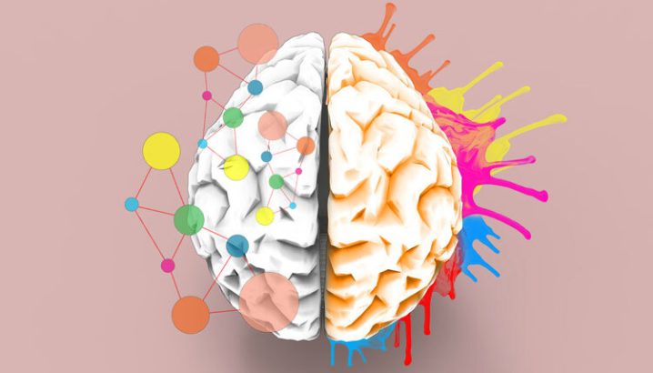
These three components play a crucial role in the psychology behind effective website design, influencing how users perceive and interact with the content.
By understanding the impact of color, contrast, and clarity, designers can create websites that not only look visually appealing but also effectively communicate information and engage users.
Effective websites do more than look attractive—color contrast website design helps users process information faster and take action with confidence.
How Color Schemes Influence User Emotions and Actions
Color schemes play a crucial role in influencing user emotions and actions in design.
Different colors evoke different feelings and reactions from users, which can ultimately impact their behavior and decision-making.
For example, warm colors like red and orange are often associated with energy, excitement, and urgency, while cool colors like blue and green are calming and trustworthy.
By strategically choosing color schemes that align with the desired emotional response, designers can guide users towards taking specific actions, such as making a purchase or signing up for a service.
Understanding the psychology behind color choices is essential for creating effective and engaging designs that drive conversions and enhance user experience.
By leveraging color schemes effectively, designers can create visually appealing and impactful designs that resonate with users on a deeper level.
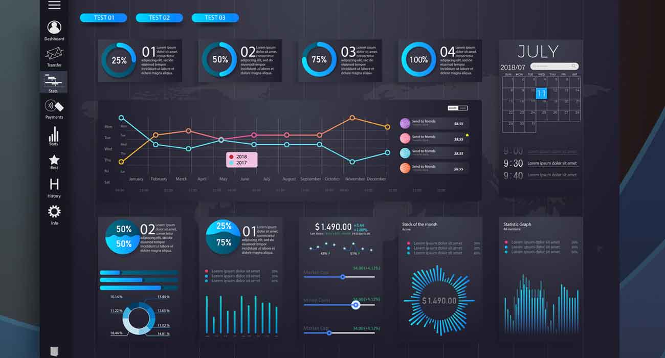
Using Contrast and Visual Hierarchy to Guide Attention
When it comes to designing a website or any visual content, using contrast and visual hierarchy can be incredibly helpful in guiding attention and improving navigation.
By incorporating contrasting colors, fonts, sizes, and images, you can create a visually stimulating experience that draws the eye to specific areas of the design. This can be particularly useful when trying to highlight important information or call-to-action buttons.
Professional Design. Real Business Impact.
Our websites help you stand out—and sell more.
Get StartedVisual hierarchy is also crucial in ensuring that your design is easy to navigate and understand.
By organizing elements on the page in a logical order of importance, you can help users quickly find what they are looking for.
This can be achieved through the use of headings, subheadings, bullet points, and other visual cues that clearly indicate the structure of the content.
In color contrast website design, different colors trigger emotional responses that can influence trust, urgency, calmness, or excitement.
By effectively utilizing contrast and visual hierarchy in your designs, you can create a more engaging and user-friendly experience that guides attention where it needs to go.
This not only improves the overall aesthetics of your design but also enhances usability and helps users easily navigate through your content.
Designing with Clarity: Reducing Cognitive Load for Better Engagement
When it comes to designing with clarity, the goal is to reduce cognitive load for better engagement.
This means creating minimalist layouts and intuitive user interfaces that make it easy for users to navigate and understand the content.
By simplifying the design and eliminating unnecessary elements, you can help users focus on the most important information and tasks.
This not only enhances usability but also improves the overall user experience.
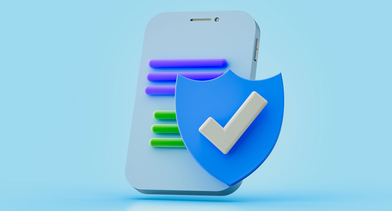
Strong color contrast website design improves readability by making text, buttons, and key content easier to notice and understand.
Visual hierarchy helps guide user attention toward important content and actions on a website.
Minimalist layouts with clean lines, white space, and clear typography can create a sense of calm and organization, making it easier for users to find what they need.
Intuitive user interfaces that follow established design patterns and conventions can also help reduce cognitive load by making interactions predictable and familiar.
A strategic color contrast website design approach uses size, spacing, and contrast to naturally guide user attention toward important actions.
By designing with clarity, you can create a more engaging experience for users and increase the likelihood of them accomplishing their goals on your website or app.
Built for Speed, Style, and Sales
Modern, responsive, and designed with your customer in mind.
Get StartedSimplicity is a core part of color contrast website design, helping reduce cognitive load and improve engagement.
By utilizing color, contrast, and clarity strategically, website designers can create a seamless user experience that keeps visitors engaged and encourages them to take action.
Whether you are designing a website for your business or personal use, incorporating these principles can make a significant impact on the success of your online platform.
The best color contrast website design combines aesthetics with usability, ensuring websites look strong while remaining intuitive.
Remember, the design choices you make can have a powerful influence on how users perceive and interact with your website, so take the time to consider the psychological impact of your design decisions.
Businesses using color contrast website design often create more engaging and memorable digital experiences.
Color contrast website design helps transform visual choices into measurable improvements in usability, trust, and engagement.
Want to design a website that truly connects with your audience? Call us at +91 77604 87777 or reach out via our contact form—we’ll be in touch shortly. Let’s apply the psychology of color, contrast, and clarity to create a visually compelling site that enhances user experience and drives engagement.