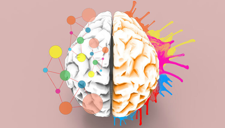
The use of colour is crucial to how users interact with your website. Regardless of what you sell, your brand needs to tell its narrative with the correct colour scheme. Your team can better convey particular emotions to your audience by using colour psychology in web design. You can increase your marketing goals by using specific colours.
This blog will guide you about colour psychology and how to use colour in web design choices.
What is Color Psychology?
The study of colour’s psychological effects on behaviour is known as colour psychology. We come into contact with a wide range of colours every day, which influences our attitudes and feelings. We even base our purchase decisions on these colours. Because of this, firms must exercise caution when selecting their logos, storefront displays, and website development.
Customers’ perceptions of a brand can be strengthened by using the appropriate colours. Brands can communicate through their colours without actually having to communicate at all.
5 Ways to Use Colour Psychology in Website Design
Website Background
Your website is assessed by visitors as soon as they come to the main page. Within 90 seconds of first viewing, customers make a subconscious decision about a person, condition, or product, and that assessment is based on colour. The background colour is a crucial component of your website’s visual design. The text, buttons, and icons will all have the colour you select.
Website Headlines
Selecting the correct colours is only one aspect of colour psychology. Colour selection also needs to take your marketing campaign’s context into account. When choosing a colour to enrich user experience (UX), your team should think about how you want customers to feel about it and where it will be used. Just make sure that you compliment your brand personality with the help of your colour selection.
Website Prime Image
A prime picture is a sizable banner that is pinned to your homepage’s header. It greets visitors to your website as soon as they arrive. Prime pictures are important since they frequently communicate a differentiator for your company. It could tell the story of your brand, present your merchandise, or provide a virtual greeting to guests.
Call to Action Buttons
The goal of your website goes beyond just increasing brand recognition. Your website must compel visitors to take action if you want to make money. This may be completing a real purchase, enrolling in a newsletter, or registering for a product trial.
Your call-to-action buttons need to be a noticeable and distinguishable colour. Be bold and original rather than just mimicking well-known companies in your field. The only way to differentiate yourself from the competition and develop an authentic brand is to do this.
Website Pop-Ups
Pop-ups are a useful marketing tool that improves the experience of visitors. They aid in your brand’s consumer targeting by providing options for email sign-ups, special deals, and relevant offers. This is an additional method of guiding guests into your nurturing cycle.
Final Takeaway
Think about how you use colour in each element of your pop-up design. Select the colour theory that you think could work well for your website, use it, and then find out what your customers or social media followers think. When selecting the colours for your website, hire professional designers. Having them create your website would be a better choice, and they’ll assist you in choosing the appropriate colours for it.
Call Adroitte
Contact us to discuss your web design requirement. Call us today on +917760487777 or 08041127377 or message us on our contact form and we will reply back ASAP. We can discuss how we can strategically digital marketing for your organization.


