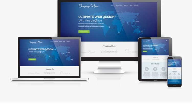
More than 55% of searches are launched from mobile devices, clearly indicating the need for website designs to be mobile responsive. With rapid advances in technology and the large number of models presently available in the market, it is necessary for websites to ensure that designs scale and fit screen sizes of all mobile phones. A lot of good website design checking tools like WebCEO, W3C, Google Webmaster, Bing Webmaster are available in the market. Here are clear reasons that justify the need for a responsive web design checker.
Compatibility across models and browsers
Designers get to check the dimensions of screens across various mobile devices. The ability to render a page in a manner similar to that of an intended mobile device helps in the design of website pages that will work across all devices. Viewport tools help designers to check the compatibility of designs and layouts across all browsers in various mobile devices. This helps create uniformity and prevents confusion that is generally associated with different layouts in various browsers and device combinations.

Design parameters
Various design parameters impact the website code. Validation of the screen size of users followed by display of the right layout without any difference between two different screen sizes is important in the digital era. Mobile devices are not only the devices of choice for browsing or searching but are also the devices in use by employees when handling customer queries. It therefore makes sense to ensure that all mobile devices have similar displays without the dimension of the screens affecting the layout.
The resolutions of various screens differ as per models and dimensions. Models are designed as per the different requirements of users – accessing apps, watching videos, playing games, browsing, transactions, and messaging, among others. The onus of designing responsive websites lies squarely on website owners, who need to ensure that their webpages are displayed properly across all screen resolutions in device and browser combinations.
Designers who get to preview the screen sizes and different resolutions will be better equipped to redesign and make appropriate changes. This will help reduce the time that is required for completion of the designs as per desired outcomes.
Call Adroitte
Contact us to discuss your website design related requirement. Call us today on +91 7760487777 or 08041127377 or message us on our contact form and we will reply back ASAP. We can discuss how we can strategically implement website designing successfully for your organization.