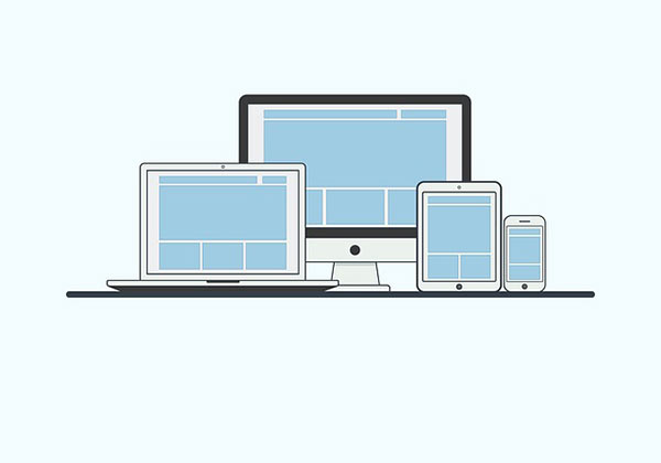
The digital landscape is evolving at a rapid pace, once considered the most expensive subject; the word responsive today has made its way to every corner of the online business. Responsive websites have become a need and not an option. With the slogan ‘Mobile first approach’ making rounds, the conventional desktop-first approach is slowly finding its way to exit.
Importance of Frameworks in Responsive Web Development
The word responsive is all about how the user interacts with websites and web applications across various devices and platforms. Till now, we have seen numerous frameworks working through every developer’s desk, while trying to make an off-beat mark.
Frameworks are the most important tool in developing any sort of website, which will be either a static or dynamic one. In this blog, since we will be dealing with responsive websites, it is better we focus more on Bootstrap.
What is a Bootstrap?
Bootstrap is a free, open-source front-end web framework. With numerous JavaScript extensions, and HTML and CSS-based design templates, Bootstrap makes the most suitable choice for both amateurs as well as experienced web developers. With its latest version being compatible with major platforms, Bootstrap is certainly good news for every web developer.
‘Responsive design by default’, which is nothing but the ‘mobile-first approach’, is being consummately supported under Bootstrap.

List of 2017’s Top Four Bootstrap Templates
- Imperial-
- A modern one-page Bootstrap template, imperial is a welcome mat for businesses who seek for highly creative and functional websites. With header acquiring the full-screen segment, this bootstrap theme guarantees productive brand marketing.
- Easy to customize and with more than 600+ font icons, the imperial theme can easily increase the aesthetics as well as scalability of a website. Also, this template promises with better browsing experience through its modern off-canvas mobile menu feature.
- Himu-
- A free, responsive one page template, Himu is W3C validated. Easily customizable, this template is compatible with major browsers. Based on Bootstrap 3.3.1, Himu features a multipurpose theme and guarantees smooth scroll without affecting the user experience.
- Maxim-
- Again we are coming across one-page site template, which, comes with a flat UI design. With a validated HTML 5 code, this template assures a good accessibility across all the major browsers.
- Each of the components in this template is Twitter Bootstrap compatible. And with 56 animations and variable 300 font icons, people can easily customize their profiles or websites in accordance by trending practices.
- Acura-
- A modern HTML5 based template, Acura makes an exemplary choice for developing corporate, business and other organizational websites. As a responsive web template, Acura ensures optimal viewing and navigation across multiple browsers and devices.
- One can expect a remarkable flexibility while dealing with this template as it is written in HTML5 and CSS3 programming languages.
Developing a custom website from scratch will be both daunting and expensive. But with the involuntary flow of highly functional templates, one can easily develop professional looking websites without any kind of impediment.
With a lot of built-in functionalities, widgets and other options, templates are making website development as an easy activity. With numbers rising to thousands or maybe even more, one can easily go with designs that are tuning with their budget range.
Call Adroitte
Contact us to discuss your responsive website development related requirement. Call us today on +91 7760487777 or 08041127377 or message us on our contact form and we will reply back ASAP. We can discuss how we can strategically implement responsive website development successfully for your organization.