Only 35% US adults owned smartphones in 2011 according to a Pew Research Study.
Four years down the line, in 2015, the number almost doubled to 68%.
Globally, it is predicted that around 2.6 billion people will be using smartphones by 2018.
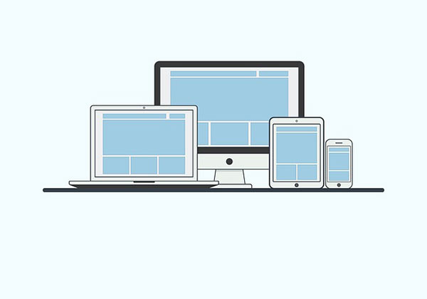
So, it becomes very important that your digital presence is spread over a range of devices, from a laptop, tablet, smartphone to the latest innovation.
You may be wondering, “Is it possible for my website to be so adaptable?”
Will it fit into devices of various screen sizes and resolutions?
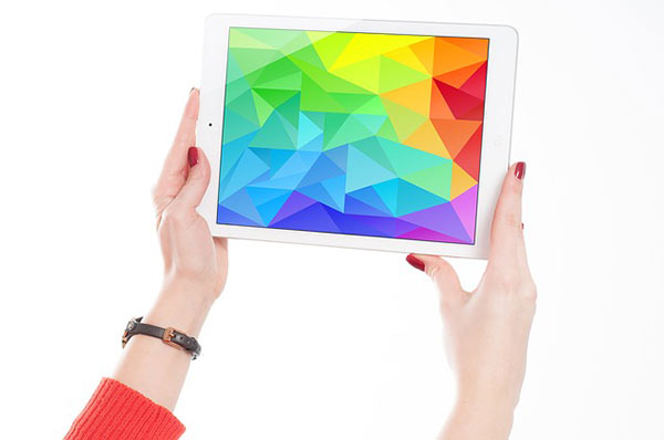
Can you reach out to all your customers, from frequent iPad users to Samsung smartphone users?
What if, you wake up, and find that some sci-fi fantasy movie is for real?
Imagine just signaling with your hands for various resolutions of digital data to appear out of thin air!
This is where responsive web design comes in.
Responsive website design – What is it?

A responsive website design, as the name itself suggests, responds to a user’s needs and their devices.
So, are you curious to know when this term began to be used?
The term, responsive web design, was first used by Ethan Marcotte, a web designer, in 2010. In 2011, he wrote a book titled Responsive Web Design.
Responsive web design was ranked 2nd in top web design trends in 2012 according to .netmagazine study.
Responsive web design involves elegant coding which seamlessly helps you to go through a site from one device to another.
With the help of neat coding, responsive web design enables a website to look awesome on any device.
Through responsive website design, the website can be resized, adjusted, enlarged, shortened, parts hidden or moved. The result is that you have a good user experience on almost all available devices.
You may have noticed that some websites display two to three column views in a laptop. When you go to same site on your smartphone, you will find a single column view.
You will also find that you are equally engrossed in doing that online course, be it on a laptop or a smartphone.
In fact, you may find that you are increasingly on the smartphone to complete that online course which you started on your laptop.
Responsive web design makes all this possible.
Making Your Website Responsive – How?
When you switch between your laptop or desktop to a smartphone, your website also needs to switch from landscape to portrait.
For this to occur, sometimes, for the title to come into focus, certain other portions like illustrations appear to be cropped off.
This is done by creating fluid or flexible layouts.
Consider the following scenario: In your website, you have two columns in which each column has three points about your online business.
Through the use of breakpoints in CSS, when you go to a smartphone, the two columns will appear one below the other instead of side by side very seamlessly.
The various techniques for responsive website design include fluid grids, media queries, flexible images and much more. This is through elegant coding (with CSS, JavaScript, etc.) along with discerning mark-ups.

A neat way in which responsive website design is possible is through CSS media queries.
With a true/false syntax for certain conditions, a device can be checked for width, height, orientation, resolution, aspect ratio and respond and adjust for optimal viewing. Targeted media queries can be done for commonly used resolutions, 320 px, 480 px, 600 px, 900 px and 1200 px.
Normally, the devices are classified according to browser widths as small (under 600 px), medium (600 to 900 px) or large (over 900 px).
Smartphones and other such mobile devices come under 600 px. Tablets come between 600 to 900 px. Desktops and laptops are over 900 px.
With responsive website designing, certain portions of images can become hidden for other required details to be highlighted.
Also, sometimes, the whole image with the content needs to be in place. You may not want an image to appear to be cropped off.
Well, in this case, what appears to be a single image may consist of a composite set of images placed deftly.
Thus, when you or your customer transition through a variety of devices, the composite set of images adjust accordingly.
The composites are coded to respond to produce a single image effect on any device.
The UI/UX (user interface/user experience) becomes excellent on any device through the flexibility that responsive website design allows.
Through adept responsive website design, your customers will go through your website without batting an eye, whether they are on a laptop, tablet or a smartphone.