Mobile web development services are comprehensive and extensive, which means that by choosing the right development package you can get services that will allow you to partially direct the design, oversee the development process, get features that you want and finally get the final product which is a fully functional mobile website. Irrespective of whether you are involved in the designing process, you must know mobile web designing basics so that you know when a website is right for your business or it just won’t reach the mark.
- A Template with Too Many Images – Ideally, a good company that offers mobile web development services will alert you not to use too many images on a mobile site for 2 reasons. The first reason is the template will get hard to load on mobiles with limited bandwidth which will affect your analytics as well. The second reason is that most users might not want to see a website with only pictures, which might cause a decline in user experience.
- A Content Heavy Template – A content heavy template should be avoided for 2 reasons, the first reason is, the user will lose interest in the website in just a few minutes, the second reason is, the website will lose its appeal to people that fall into a younger age group. If you are aiming to create a spectacular website then consider finding a template that allows you to add just the right number of pictures, text, videos and other content.
- A Template with an Excessive Number of CTA Buttons – Call to Action Buttons can be used freely, yet not in excess for websites that are to be browsed on desktops. Mobile sites on the other hand need to have limited but attractive and slightly large buttons that can be clicked on easily. These should be available not only on the home page but also all the landing pages.
Important Note – Mobile Web Designing Basics
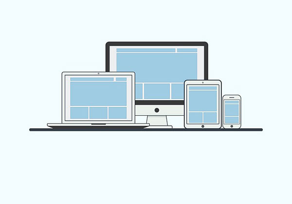
When developers create mobile websites, it is crucial that the mobile site is created on the platform it is meant to be used on which in this case is, mobile phones. The developer might want to test the website on a desktop website later, which is perfectly fine provided the layout, planning and execution is all done through mobile phones. Responsive websites are a bonus for businesses who do not want to as yet create mobile apps. Responsive website templates allow your users to get a good user experience, irrespective of which smart phone they use, as responsive templates shrink or enlarge the aspect ratio of the page as needed.