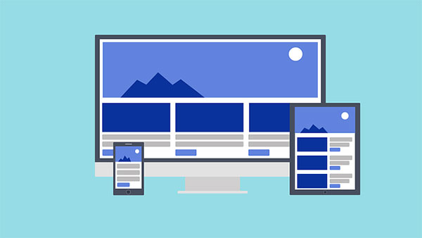
Responsive web designing has become one of the path-breaking concepts in the web development industry. The gracious transition from a simple static web design to responsive website has opened windows of opportunities.
Not only the mobile users experienced a better usability, but the online marketing also became more resilient to conduct. But as a seasoned web professional, one would know the challenges faced under responsive website designing. A web designer has to effectively deal with concepts of proportion-based grids, flexible images, and finally media queries to give out a highly functional, user-friendly responsive website.
Principles of Responsive Web Designing (RWD)
The main concept behind responsive web designs is fluidity, the consistent user-experience across all the devices. Even though uniform functioning was maintained, the quality of web elements was compromised in the process. An image is one of the most important web elements in optimizing the performance of a site. And in order to maintain the progressive pace of a website it is necessary to maintain the quality or resolution of these images.
What are Responsive Image Breakpoints?
Before pitching in to this question, firstly we should know why image breakpoints in the responsive websites?
Image resolution plays an important role in uplifting the appearance of a website. An image either with stretched or heavy appearance will not look good and most importantly can affect the search engine rankings. It’s raining with devices and for each device; the viewport of a web page differs unconditionally. In such cases, the image quality is compromised either through its dimension or resolution. To counter this, the fixed-step-size strategy was used, which was also an inconsistent approach due to the issues with image-width.
A single image across varying dimensions, surely it is obvious that the image resolution should be accurately selected to avoid quality degradation. Also, dealing with image-widths was a major concern for the web developers, which was finally dealt through responsive image breakpoints.
This can be an error-free approach, as precise responsive image break-points can be automatically generated through either cloud-based API or a responsive breakpoints generator tool.
Even after all these discussions if you are still confused with our hero topic, then let me give you an explanation in layman terms. The responsive image breakpoints deal with the act of deciding the type of image resolution and the number of image versions of a picture.
The Approach: Adapting to the Resolution
Yes, now we have come to the most crucial part of this blog. Here, irrespective of a breakpoint generator tool we will learn about how to decide and add a break point.
The best way to deal with responsive technology is to go with the mobile-first approach. Why? Obviously it can be the most basic question from one who has started with a traditional desktop. So why to go with a Smartphone rather than a desktop?
If we go technically, the most suitable answer is the viewport. We all know that the mobile phones have the smallest viewports. So once we start with the smallest image viewport and expand that image, we can add breakpoints wherever the image quality is poor. This way we can precisely decide the accurate breakpoints for each image respectively.
The Bottom Line
With final words we can say that in future responsive websites will be a place with no loss in image quality. The term ‘responsive image breakpoints’, has truly made the approach to responsive website development a whole lot easier.