The benefit of having a great church website is you will have more people visiting your place. A website homepage is the first point of contact people have online and your church website will be no different. First-time visitors become repeat callers only if they find your website interesting.
A homepage makes a website interesting. It’s like a movie poster. When you see a poster, you get some idea of what you might expect in the movie and decide whether you should be watching or not.
Quite similarly, a website homepage, by the grade it is designed and the way elements are put gives you an insight into what you might find on the website.
A website homepage may be intriguing or appealing, but you should aim for the second unless you want to test how things might go for your business in the online market.
I’ll definitely discuss the elements that SHOULD be present on your church website, and before that, there is something you need to know.
A website comes with a home page, product page, landing page, hmmm, I guess that’s it. Each designed for a definitive purpose. A user when land on either of these pages will get answers and only then, he’ll proceed further down the site and make things good for your business.
So it’s not wrong if I say each of these web pages have at least something to explain, right? So, what does a homepage have to explain? If you understand this only then it would be easier to guess about having elements that would help you do the explanation.
Your Website Homepage Should Answer These Questions

Who are YOU?Tell who you are in one simple sentence. Your homepage should have WELCOME words and convey your customers who you are and what you do. Don’t over explain; use fewer words, high-quality images or videos to convey your brand message.
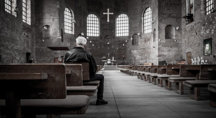
Personalized photos can do wonders. Since we are designing a church website, how about using the actual image of your place?

How are you BETTER than your competition?You are not the only one providing service, so why should people visit only your church?
Make use of the homepage and include benefits or privileges people get when they visit your church in few solid points and be the number one choice.

How CREDIBLE are you?It’s necessary you explain why people should trust you and not the other guy.
Have testimonials that would show you are trustworthiness. Include a small gallery of personalized images of services or events and attract your website visitor’s attention instantly.
Once you have the principles laid out, it is necessary you have the principle elements that would make first time visitors, your permanent visitors.
Majority of church-goers today prefer to visit a church online before they visit the place in person. Shocking??? But that’s the fact. A decade ago people would consult others about a place they want to visit, but know they are taking help of a website, so to speak of the facts nothing has actually changed. Only the medium has changed.
Churches should be aware of this transition and no longer can rely on just the word-of-mouth policy to build their reputation.
To get your spiritual message across to the people, you need to make your website completely speak of your missions and vision. Since the website homepage is the front door of the website, you should add few good elements that would make your online visitors stay for long. Because maybe if they stay for long, they may find something interesting about your church and visit in person???
Elements of a Good Church Website Homepage
Simple design, bold messages, great use of colors, well, that is how I expect my website to have because even customers love the same. With that in mind, I’ll be explaining elements that you SHOULD at any cost have on your website homepage.
1. A Value Proposition
Collectively, by defining your value proposition, you will give church-goers a good reason to visit your holy place. Adding a few words that will induce trust and faith in people will help you win over them.
In simple words, a value proposition can be called a ‘tagline’. It defines you, differentiates you, and highlights you.
Your tagline should be for people who are looking for something new or dissatisfied about the previous service, and your product/service should appear the best alternative for them.
You have to give the message in fewer words and in a compelling manner.

2. Compelling Call-to-Action
‘City First Church’ their website has clearly defined the importance of call-to-action. If you are a new visitor, you will easily find a CTA at the center of the homepage that is designed to guide you through further processes.
It’s the same for the ‘Trinity Fellowship’; they have a well-designed call-to-action above the fold. Visitors no way are going to miss the button as it has clearly defined the purpose. It reads something like this, ‘Find Community’. Surely, you will be looking to find information once you are on a church website, and this site has clearly met that purpose.
Think as a person who is about visiting your website. Plan how you can make their first-time visit easy and convenient. Use actionable words and place the CTA logically on your website.
3. Intuitive Navigation System
Since you are not selling products or running an e-commerce business keep your website navigation structure simple and intuitive.
The first time visitors should not feel confused roaming around your website. If they need to learn about service times or other events, they should be able to in less number of clicks. The more you make them roam around, people will be less interested to take your service or attend the events. So make sure your website navigation structure is clearly obvious.
4. High-Quality Original Images or Videos
No stock photos, but add the actual picture of your church and members of the community. It’s the best way to make people admire and trust your place.
Give website visitors a small glimpse of the holy place they are to visit. Use hero image or video for your homepage. Not only you will garner more views or gain better user engagement but will improve your site’s SEO value.
5. Testimonials/Social-Proof
Request people who have already visited your church give feedback about the services and programs. Let them tell how they felt or what made that difference, or how it made an impact on their life journey. Adding such thought-provoking feedbacks is a bonus for your website image.
You need not work much towards building a relationship with the new audience. People trust peers over your marketing content, so include testimonials in your website homepage.
6. Worship Times/Contact Information
What is the ultimate reason for you having a website for your church or thinking so much about a simple homepage?
You want people to visit your church and experience your service, right? So when you are designing your website homepage make sure your address, the directions for the place and the worship times are prominently displayed.
If you have a gathering on Sunday from morning 9:00 to 10:00 AM, give proper details about how your website visitor can be a part of that program.
Whether it is a website for church or business, there are some key functionalities and elements that should be available. All the elements discussed here are the basics that define a modern website. Each one of them has an essential role to make the user experience good and memorable.
Call Adroitte
Contact us to discuss your NGO related website design requirement. Call us today on +917760487777 or 08041127377 or message us on our contact form and we will reply back ASAP. We can discuss how we can strategically implement NGO website design successfully for your organization.