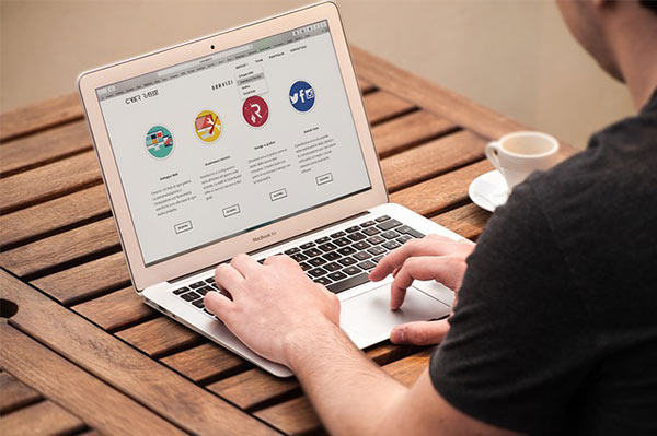
The CTA button is the most important element of a landing page. A good CTA button should engage, explain, and convert. To be more discreet, it should engage the customers, explain the product benefits, and finally push your customers to convert.
Your visitor may be impressed with the content, layout, or even the typography, but in the end, if he wants to convert it will be through a CTA button.
Keeping its effectiveness in mind, there has been a lot of discussions lately regarding what color should be used or what words to add while designing a CTA.
CTA is such a small element, but a lot can go wrong if you neglect this power button. Here are few points that you should effectively follow if you going to design CTA buttons for your website.
- Stay Away from Friction Words; Use Action Words
- The first question that comes to your mind,
- What are friction words?
- Words that would ask the viewers to give something rather than take. Words like “give”,” donate”, “buy”, “sponsor”, asks for ‘TIME’, which is more valuable for a visitor than money.

- Instead, you can use action words like “Download”, “Discover”, “Start”, “Join”, and “Get” that speaks about giving something valuable to the visitors.
- It’s not easy to play with words, so creativity is a definite requirement here.
- Explain the Purpose of the Click
- People, like most of them, will think at least for few seconds when they come across a CTA button like this,

- A quote goes like this, ‘Suspicion is most often useless pain.’
- People don’t understand this, rather they would prefer staying safe by not clicking if I have to speak with reference to the present context.
- Instead of just directing the visitors to click, explain the purpose that would reassure them of something.
- If I have to give you a discreet explanation, instead of designing a vague button, make it more up-front.
- Directly use those words that explain why they should click. If we speak about some subscription offers, you can write,
- Instead of

- Looks convincing enough for me, and I don’t think any visitor would even bat his eyelid before clicking because you have improved the value and purpose of the CTA button.
- Choose The Appropriate Screen Area
- A website or say any content piece is read with left-to-right and up-to-down approach. So take it as a valuable advice, never, ever keep a CTA button at a place where a visitor would just start to see.
- People generally prefer to read content or information that would speak about the business and products. Once they get comfortable with the website and then if they come across a CTA button, they would definitely think of taking the action that you desire.
- This doesn’t make the left side screen less impactful, it depends on other website elements. But if we go by general human sight pattern or the way they scan the content, then the right side or the midsection should be fine for placing a CTA.
- Make the Size Prominent not Dominant
- You are not having a mega sale on your website or bidding for a prominent banner size. So keep the button size logical, in the sense, prominent, visible to the naked eye.
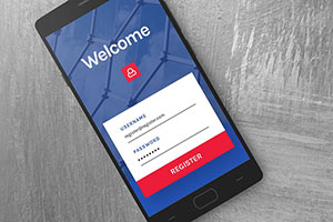
- Now, we are in the SmartPhone era, design the CTA so mobile users would find it easy to perform the conversion task. Keep the CTA button mobile-friendly.
- Design in Contrasting Colors
- To make a CTA noticeable, use colors contrasting to the background. And of course, the content and the background within a CTA should also be contrasting.
- Pick out a color combination that compliments and stands out against the background and watch the impact on conversion rates.
- A small suggestion for you,

- – If the size of your CTA button is big, use less intensive color, of course, relative to the background.
- – If you have designed a smaller CTA button use bright colors to make it visible.
